Instrument clusters, good and not so good

You’d think that, 120-odd years into the history of the motorcar, manufacturers would have pretty much nailed legible instrumentation by now. In many cases they have; in others, I’ve found, not so much.
Consider the cluster on the Porsche 911 above. This one happens to be on a 1982 911SC, but it’s virtually identical to any 911 spanning four decades. Porsche gives you the most critical instrument in a sports car—the tachometer—front, center, and huge. White numbers on a black background, because nothing contrasts better than white on black. You don’t even need to take your eyes off the road to monitor progress through the gears. To the right is a slightly smaller but equally legible speedometer, and to the left the important engine-monitoring gauges (for an oil-cooled vehicle) of oil pressure and temperature. Those gauges that do not need to be read instantly, such as the clock and fuel gauge, are off to the side where you might need to move your head a bit, but not at a moment’s notice.
The 911’s cluster is angled directly at the driver, and inset a distance perfect for preventing overhead glare while not shading them too much. In fact I’ve never found myself in a position in which incoming sunlight or artificial light obscured the instruments beyond easy reading.
One might expect such perfection from the über engineers at Porsche, but in fact the prosaic chrome-ringed Smith’s instruments on my old Triumph TR6 are nearly as good: Tach and speedometer big and up front, auxiliary gauges on the side. (Plus the added charm of that walnut veneer, of course.) The Smith’s have shiny glass fronts that seem to reflect a bit more than those on the Porsche. But notice the same eminently legible white on black motif. And they’re shaded just deeply enough that no sun coming through the windshield can hit them.


I found a similarly flawless instrument cluster in the Mercedes Benz 300D we owned for a few years. Again: white on black, important stuff up front—in this case the speedometer, so we could keep track of the needle’s slow crawl across its arc as we floored the accelerator pedal and waited patiently for results. I’m not even sure why Mercedes bothered with a tachometer on the automatic-equipped cars; a calendar would have been better at recording progress.

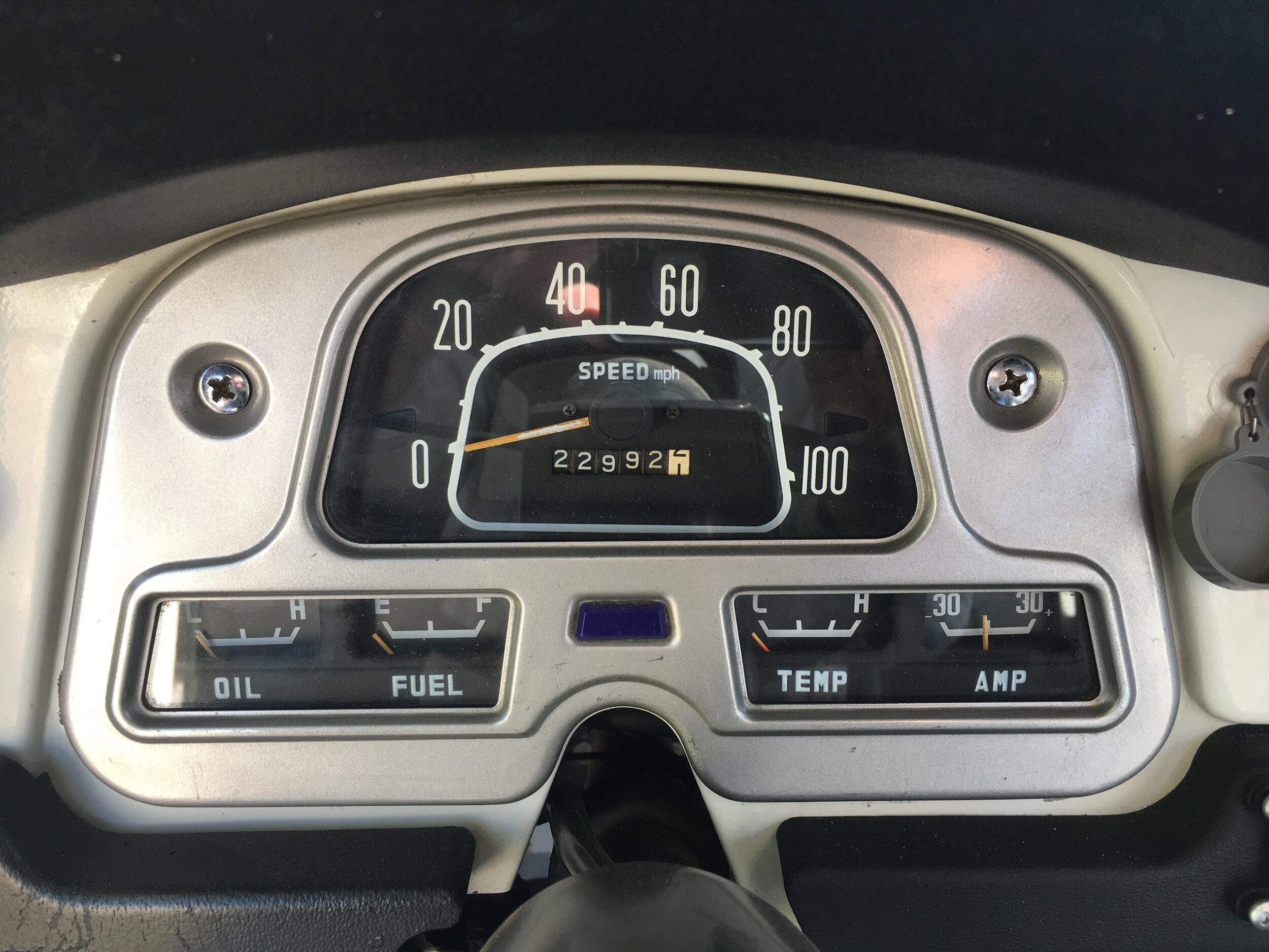
Moving on to four-wheel-drive vehicles, the 45-year-old industrial gauge panel in my FJ40 is nevertheless peerless in function and legibility. Again, white on black. The only sign of age on this panel, after four decades and 320,000 miles, is the peeling orange paint on the speedometer needle. (Note, too, in all the examples so far, the comprehensive nature of the information offered, from oil pressure to amperage. Sadly gone on most vehicles now, although some electronic dashes allow you to call it up on a side menu.)
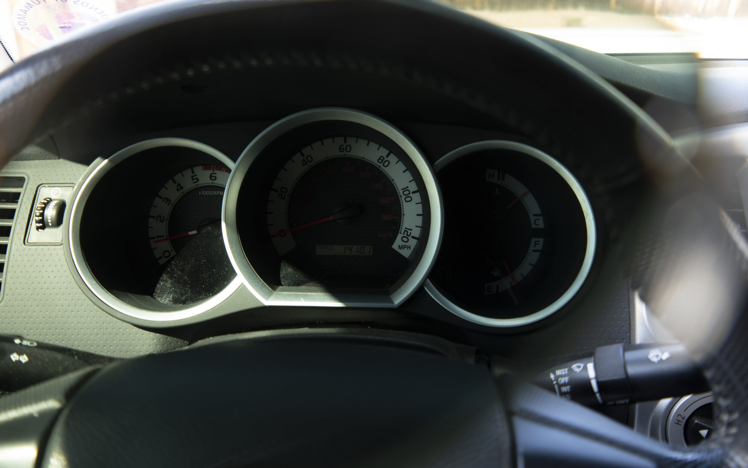
In contrast to all these examples is the instrument cluster on our 2012 Toyota Tacoma, shown here in ideal light:

At first glance, it doesn’t look bad. But notice that, instead of simple white lettering on a black background, as on all our previous examples, Toyota introduced a black background with a white band around the perimeter and black lettering, as well as a spurious “carbon-fiber” looking pattern on the black background. The gauges are also so deeply inset that, even in this photograph, you can see the shade partially obscuring the figures on the left of each gauge. Note as well the extremely poor contrast of the red kilometer markings, completely invisible on the left of the speedometer.
Now look at the same cluster in partial sun from the side, and through the lens of a pair of sunglasses.
Not only do the numbers on both speedometer and tach become nearly illegible, the red needles also disappear against the black background, and even their tips show poorly in the white since you can only see about a half inch of each.
I noticed this characteristic shortly after we bought the truck, and it has annoyed me ever since. I constantly find myself turning my head a bit to look around my sunglasses to see what my speed is. Even turning on the headlamps (and thus instrument lights) doesn’t help. I have the feeling this arrangement was configured on a designer’s computer screen and never actually tested before it went into production.
Fashion is all well and good, but it should never interfere with function.
Designers: White on black. Please. And don’t put the gauges in a cave.